You publish. Reels, carousels, photos — the work goes on, content comes out. Then you open Insights. Views. Likes. Saves. Reach. You look at these numbers — and what?
Tell me honestly: do you understand whether this is good or bad? And the main thing — do you know what to do next week so there are sales, not just activity?
I see this picture constantly. A person works, films, posts — and makes decisions at random. Because the numbers are there, but there is no answer in them.
So let's break it all down, piece by piece. In this article — every indicator I look at myself: where it lives in your Instagram, how it is calculated — with a formula, how it reads through money, and what to compare it against.
And the main idea right away. Keep it in your head; it will repeat in every section. Everything I lay out below, step by step, you can do by hand. It is real. Only it is hours of work every week. And exactly those same steps can be done by a free analyzer agent in your Muse: same indicators, same formulas, same rhythm. So read this article as an instruction for manual analysis. And at the same time — as a description of what the agent will do for you on its own. At the end — a form: fill it in, get the PDF and the master prompt, build such an agent for yourself.
The short answer: two supports for the analysis
Look: the whole analysis rests on two simple things.
First. Every result you compare with your own channel's norm. Not with other people's accounts. Not with "market averages." Someone else's million views is someone else's niche, someone else's budget, someone else's audience. Your median is your reality. From it, movement shows: growing or falling.
Second. Every number is a link in one chain: reach → profile visits → conversations → enquiries → sales → money. Content earns when a person moves along this chain. And a weak number almost always means one thing: the chain breaks in a specific place. And that place is the one to fix, not "content in general."
Got it? The channel norm — and the chain to money. Next — the details.
The content factory: analyzing your own posts is the first of three pillars
How does our content work? Like a factory. A closed loop: plan → publish → measure → advise → new plan.
The plan says what we publish. A post goes out — the analyst measures the result and writes conclusions. The conclusions become the input of the next plan. Now imagine the "measure" link is missing from the loop. What then? You publish — and repeat the same movements at random. Week after week.
The plan has three inputs. I call them pillars.
Pillar 1 — your own posts. What of what is already published works, and where the main problem is. That is this article's topic. And this pillar is the one I give away free.
Pillar 2 — competitors. What works in your niche right now.
Pillar 3 — your audience's pains and questions. People's verbatim questions your content has to answer.
The week's plan is born at the intersection of the three. Pillars 2 and 3 need account pools and weekly pipelines — that is the full factory as a service.
And you start with pillar 1. Why? Because it is the footing for everything else. And look: the indicators of exactly this pillar — the ones I break down below — are what we put into the agent. It measures exactly them. By exactly these formulas.
The map of numbers: where everything lives in your Instagram
Before counting, you need to know where to get the numbers. Agreed?
All of them are in the account's professional statistics, in Insights. It is available if you have professional access and a public profile.
And here is my advice. If you have not done it yet — do it now: switch on a business or creator account. And uploading media at maximum quality. Why does it matter? Without a professional account, there are simply no statistics — nowhere to take all this article's numbers from. And maximum quality keeps your videos sharp. And sharpness is viewer retention, which we will measure below.
So. The numbers live at two levels. They must be distinguished — this is fundamental.
The account level for a period. This is the main statistics screen: views of all content, reach, interactions — likes, comments, saves, reposts together — profile visits, taps on the link in your bio. The same place shows the split: how many views came from followers, and how many from non-followers. Almost all of this article's formulas are calculated at exactly this level. The window is 7 days.
The individual post level. This is what the platform shows for a specific publication. And what a connected app — and therefore the agent — receives for each post: likes, comments, and the post's content itself. The text. And for videos and carousels — the structure too: by seconds, by slides.
Now, attention. Views, reach, saves and reposts for an individual post do not exist. They exist only as account-level totals. The platform does not attribute them to a specific post. So I judge a post by the "likes plus comments" pair — against the channel norm — and by the breakdown of its content. And the chain to money I calculate at account level. If some agent names you views for an individual post — it is inventing them. Plainly inventing them.
This two-level map is what the agent keeps in front of it in every breakdown. That is why its verdicts are honest: every number stands at the level where it truly exists.
Metric 1. Views and reach: the ceiling of your sales
Where to look. The main statistics screen, 7-day window. "Views" — how many times your content was watched. "Reach" — how many different accounts it reached. Nearby — the viewer count. Views also split here into followers and non-followers.
How to calculate. By itself, the views number is raw material. It becomes an indicator in two ratios. First — the non-follower share: views from non-followers ÷ all views × 100%. This answers a simple question: does the content bring new people in, or does it circle among your own? Second — week-to-week dynamics. The same indicator, the same window. Movement shows.
How to read it through money. Views and reach are the top of the chain. The ceiling of your possible conversations. And now I will say it directly: by themselves, views give zero money. A million views can give nothing. And 20 thousand views from the right people give enquiries and payments. Feel the difference?
So I read views only paired with the next links. Reach grows, but visits and conversations stand still? Then people watch the content, but it leads to you weakly. And what needs fixing is not the publishing volume, but the link between the topic and the product. And the non-follower share shows whether your market is expanding. When almost all the reach is your own followers, sales run into the size of the audience you already have.
In the open example later in this article you will see: 626 views for the week, of which 87% were non-followers. This is simply a sample of what the split looks like. Your norm will be your own.
And this measurement — views, reach, the non-follower share, dynamics against last week — the agent does itself. At the start of every breakdown.
Metric 2. IR — the Reaction Index: the method's headline number
What it is. IR — the Reaction Index. Also known as the engagement coefficient. It shows a simple thing: what share of the people who saw your content interacted with it. This is the headline numerical indicator of engagement. And engagement is the fuel of promotion: by reactions the algorithm decides whether to show your content to new people more often or not.
Formula. IR = (likes + comments + reposts) ÷ views × 100%. For the last 7 days, at account level. You take the week's total interactions on the main statistics screen — and divide by that same week's views. Example: 1,000 views, 50 reactions. IR = 5%.
The benchmark. For small accounts, a good IR is from 10% and above. That means a very engaged audience. By the way, statistics for such measurements open from 100 followers.
How to read it. IR is the thermometer of your content's quality. And it has to be measured every week. Why every week? Because the weekly measurement shows an activity drop while it is still easy to fix. IR falls — what to do? My advice: change topics and angles. Not the number of posts. Volume without reactions does not save you with the algorithm. And IR is stably high? Then content lands in recommendations more often. And a new audience sees living activity — and joins it more willingly.
An important subtlety. IR is an account-level indicator for a period. For an individual post, its role is played by the same pair — "likes plus comments," compared with the channel norm for that post type. About the norm — the section below.
And one more thing. IR is the first number the agent calculates in your weekly report. The same formula. The same 7-day window. Every week, on the same day.
Metric 3. Video retention: exactly where the viewer leaves
What it is. For video, the platform's main metric is watch-through. Retention of attention. An interesting reel, Instagram promotes. A reel people leave at the third second — stops. A reel's in-app statistics show the retention curve and the point where the viewer's interest disappears.
Diagnostics by seconds. Look at how I read this.
Retention holds for about 3 seconds. That means the hook caught — a successful hook, by the way, is 20% of a reel's success. But the viewer does not go further. Neither to the main point, nor to the call. What does that mean? You need to work on the reinforcement. That is the second phrase, the one that presses the viewer into the problem and holds them to the substance. The hook together with the reinforcement is already 40% of success.
Retention holds well for about 6 seconds. After that, the delivery of the main part decides. Lively. With a change of thought every 2–3 seconds. Not "like a robot."
And the third symptom. All reels stably collect roughly the same — 1–3 thousand views each. This is "the glass ceiling": the platform's trust-checking period. The treatment is simple — keep working and strengthen the reels. Changing strategy in this period is premature.
How the analyst does it. The app connected to Muse receives a video's likes, comments and the content itself. So the agent finds the weak spot from the video's plan by seconds: the hook — type and verbatim text, where attention sags by content, the delivery, the ending and the path to a conversation. And the retention curve you check yourself in a minute — in the reel's own statistics. In the report, the agent honestly writes: this conclusion is from the content, and this one is from the numbers.
And so — reel by reel. Hook, reinforcement, delivery, ending. By exactly this diagnostics the agent takes apart each of your videos every week.
Metric 4. Your channel norm: what to compare a post against
The problem the method solves. Do you know why the numbers in statistics tell you nothing? Because you compare them with who-knows-what. "A competitor has a million" — is that a benchmark? No. "Market averages" from the internet? Also no: other people's niches, other people's budgets, other people's audiences. In our system the rule is simple: a winner is an outlier relative to your own channel's base. Not absolute views.
Formula. Separately for each post type — videos, carousels, photos — you take your channel's usual result. That is the median of the "likes plus comments" pair over recent weeks. Every new post gets its "multiple": the post's result ÷ the median of its type. ×0.5 — twice weaker than your norm. ×1 — your usual post. ×3 and above — an upward outlier. Take such a post apart separately and develop it into a series. Why? Because the channel already proved with numbers: this topic and this delivery work for you.
Caution thresholds. And now — about honesty with yourselves. The method forbids conclusions from one post or one week. Fewer than eight publications in two weeks? Judging topics is too early. Too little data, and an honest analyst says exactly that: too early. Hold a direction for three to four weeks before changing anything. An analysis that shouts "change everything" every week is noise. Not analysis.
How to read it through money. The norm answers the question: what of ours already works? An upward outlier is a vein found. A topic your audience already confirmed with reactions. A series on such a topic gives predictable visits, conversations and enquiries. Compare that with the "let's film something new" lottery. Which do you choose?
The medians by type and every post's "multiples" the agent calculates itself. You see the finished verdict — "three times stronger than the norm" — with proof. Not a table you have to decipher.
Metric 5. Profile visits and link taps: the health of the "content → offer" link
Where to look. Account level: "Profile visits." "Link taps" — taps on the link in your bio. And taps on the contact button.
Formulas. The visits share = profile visits ÷ reach × 100%. How many of a hundred people the content reached went to see — who you are and what you offer? The taps share = link taps ÷ profile visits × 100%. How many of those visits moved further — to your offer?
How to read it through money. Look: a profile visit is the first link where intent shows. The person checks: who is this? What does he sell? This is the last free step before a conversation. Reach is big, but the visits share is small? The content entertains, but connects weakly to your product. The viewer simply does not understand what you sell and why to come to you. Visits exist, but taps and conversations are few? Then look at the bio and the offer. The person came — and saw no next step. See the mechanics? This is exactly how the link where the chain breaks gets found. Instead of guesses like "probably the algorithm."
Both shares the agent calculates every week. And shows them next to last week. The break is visible immediately — in percentages, not guesses.
Metric 6. Comments, saves, reposts: three different signals
These three reactions are often thrown into one pile — "engagement." But they mean different things. And in money they weigh differently. Shall we take them one by one?
Comments — conversations that dialogues are born from. Inside comments live questions about the product. Objections. And "how much does it cost" — ready-made sales conversations. That is why I read comments not only by count, but by content too. One comment with a question about buying weighs more than ten fire emojis. Agreed? On comments, by the way, the enquiry mechanics are built too: a code word in the comments → a reply → a lead magnet in direct messages. Essentially, a comment is a person who started the conversation themselves.
Saves — the usefulness marker. What do people save? What they plan to return to. Instructions, breakdowns, checklists. For an expert and a business, this is a signal: your content works as a reference. And a reference means repeat touches of the audience without an ad budget. Honestly, though: the platform shows saves as an account-level total for the period. They are not attributed to a specific post.
Reposts and sends — reach expansion by other people's hands. A sent post is one living person's recommendation to another living person. The new viewer arrives with trust already in place. Instagram's head Adam Mosseri publicly names sends as one of the three signals that weigh most in ranking — alongside watch time and likes relative to reach. And for new audiences, sends weigh even more than likes. The platform has published no numeric weights. All the "five times more important" claims on the internet are speculation.
Likes — the weakest of the signals. I will say it as it is: a like by itself brings a sale not one step closer. Its job is, in the pair with comments, to show against the norm: did the topic land with your audience or not. No money conclusions are drawn from likes alone. Period.
All three signals the agent lays out separately. Comments — with a content breakdown. Saves and sends — as the week's totals, in dynamics.
Metric 7. The enquiries funnel: the number all of this exists for
Our position. Enquiries are a blog's main result. Views and followers are only fuel for them. So what you measure is not the audience size, but the transitions along the chain: code words in comments → lead magnets issued → conversations → enquiries. Content gives reach, but does not give these transitions? A candidate for replacement in the format test matrix.
The chain formulas. Every step has its own conversion: conversations ÷ code words, enquiries ÷ conversations, sales ÷ enquiries. And the total one: sales ÷ funnel entry × 100%. When all steps are calculated, you see which step exactly is the weakest. And the effort goes into it. Not "into content in general."
A case — as an example of the calculation. Look at a live example. In one case we broke down, the funnel was brought to 8% conversion: 200 people entered the funnel → 16 bought an inexpensive product → 3 left enquiries for a more expensive one → 1 sale at a high ticket. This is an illustration: this is how the chain is calculated in percentages and money — on a series of content built on the audience's pains. And your coefficients will be yours. From your statistics. Honest "averages" simply do not exist here.
The money formula of a post and a week. Everything comes down to one formula. Views × share of profile visits × share of conversations from visits × share of sales from conversations × average order value = the money standing behind the content. You substitute only your own coefficients. And the formula honestly shows the data boundary: conversations, enquiries and sales live in your messages and records. Instagram's statistics — in the app. The analysis joins both halves.
The agent keeps this chain whole. It substitutes your numbers from Instagram. It asks for your enquiries number in your profile. And it shows the weakest link as the week's main recommendation.
The worked example: one week in numbers
Enough theory. I will show the whole method on a live account — our analyzer test run. The week: 13 published posts — 12 videos and 1 carousel. Account-level numbers for 7 days:
| Link | The week's number | How it was calculated |
|---|---|---|
| Views of all content | 626 | account statistics, 7 days |
| Reach | 525 accounts | account statistics |
| Non-follower share | 87% | 546 ÷ 626 |
| Interactions in total | 32 | the account statistics counter |
| Likes · comments · saves · shares | 22 · 3 · 3 · 2 | the interaction breakdown by type |
| The week's IR | 4.3% | (22 likes + 3 comments + 2 shares) ÷ 626 × 100% |
| Profile visits | 9 | account statistics |
| Visits share of reach | 1.7% | 9 ÷ 525 × 100% |
| Link taps | 1 | account statistics |
| Taps share of visits | 11% | 1 ÷ 9 × 100% |
What does this breakdown say? The chain's top is healthy. The content brings new people in: 87% of views are non-followers. The audience reacts: IR 4.3% — that is slightly below even the basic example above, where 50 reactions on 1,000 views gave 5%. And toward the "from 10%" benchmark for small accounts there is room to grow — with topics and angles.
The break is in the middle. Of 525 reached accounts, 9 entered the profile. Nine. That is, people watch the content, but the "topic → who sells this" link is weaker than the other links. So the week's job from such a report is one: strengthen the bridge to the profile in your posts. Who you are. What you sell. What the next step is.
Conversations, enquiries and sales in this table are deliberately left outside the brackets. Your message records give them — the agent adds them into the chain from your profile.
And notice: this breakdown — the table, the verdict and one job for the week — the agent assembled itself. Not a single manual table on our side.
"I got 200 views" — is that good or bad?
The question I hear most often. The answer is in three steps. And all three you have just learned to do.
Step one — against your norm. Your channel's usual result is 150 views? Then 200 is above the norm. The usual is 2,000? Then 200 is a weak week. An absolute number without a norm means nothing. At all.
Step two — what happened next along the chain. 200 views, of which 30 profile visits and 4 conversations about the product, are live potential sales. And 20,000 views and zero conversations are entertainment for strangers. The money lives in the second part of the sentence.
Step three — who these people are. Your audience is business owners in your niche? Then 200 of their views will give more enquiries than 20,000 views from random people. What weighs is who watches. Quantity is only a multiplier.
And exactly these three steps — the norm, the chain, the audience — the agent walks for you every week. The verdict in one sentence — in the "Focus of the week" block.
The weekly rhythm: when to take which measurement
An instruction without a rhythm is just theory. Agreed? So here is the schedule this analysis lives by with us.
Every week, on the same day: IR for 7 days. Views, reach and the non-follower share. Visits, taps and the chain's shares. Every new post's verdict against its type's norm. One focus and three tests for the next week. The weekly window matches the statistics window — the numbers are comparable with each other.
Every reel: retention diagnostics by content — hook, reinforcement, delivery, ending. The symptoms from the diagnostics above read as hints: 3 seconds — reinforcement; 6 seconds — delivery; all at 1–3 thousand — "the glass ceiling," we hold the strategy.
Every month: a format test on the matrix — 3 formats of 10 reels each. The winner stays in work, two more formats join the test. Winning topics return in about a month — at a new angle. A separate two-week test — publishing time: one week at one time, one week at another. IR determines the winner.
And this rhythm — week, every reel, month — is the agent's schedule. It brings the weekly report itself. The format matrix and the time tests it holds in the plan. Without your reminders.
How the agent does all of this: two buttons and one prompt
Everything I wrote above is the manual method. And it works. Only it has a price: hours every week. Collect the numbers. Calculate IR and the shares. Compare posts with the norms. Read the comments. Formulate the focus and the tests. Every week — the same. That is why in our system an analyzer agent does this analysis. And this agent is exactly what I give away in this magnet.
The mechanics are simple. The PDF at the end of this article gives a link and a password to the master prompt page. The prompt is one, in English, for everyone — the agent replies in your language, the one you address it in. You copy the prompt from the page with one button. You paste it into your Muse chat. From there it leads itself.
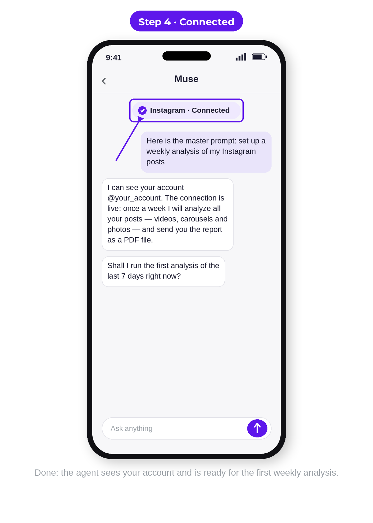
First, the agent checks: is your Instagram connected to Muse? If there is no connection yet, it stops and walks you through it step by step. It is literally two buttons in the app. Then it creates your permanent analyst: the role, the breakdown rules from this article, and your profile — account, report day and time, format. Next — the first run, manually: you see the first report right away. And the weekly schedule the agent sets only after you have approved the first report. Automation switches on only with your "yes." And no other way.
How is the report built? In two layers. The first is the dashboard: large account-level numbers with "good / weak" statuses, post engagement charts with your norm line, the week's main focus and three tests — briefly. One glance shows where you stand. The second layer is the full tables by type and post and the full recommendations: what worked and what did not — with proof. One focus and three tests in the form "what we do / why / example / how we will understand it worked." The report arrives in the chat and as a PDF file. And every report at the end carries a method signature: the project site and the account where this system is shown live.
Separately — about the price of the question. Ordering the development of just this analyzer agent costs from $1,500. A full turnkey content factory — from $8,000 (Keyhole Software's research on agent development cost, 2026, 45+ sources). And doing this analysis manually is an SMM analyst's retainer from $750 a month. You receive this agent free. Why? Because it is the factory's first pillar. And I want you to first see the result on your own numbers.
If you do not have Muse yet — registration is a separate step. It lives in a separate article: the step-by-step guide to registering with Muse. Come back here when your account is ready.
The PDF also holds the step-by-step Instagram connection instruction with realistic screen mockups. Which buttons to press. Which permissions to confirm. And how the agent will verify it sees exactly your account — it will name it back to you out loud.
Honest limits: what the analyzer does, and what lives elsewhere
I will state the limits directly. The platform gives a connected app, for each post, the likes, comments and the post's content itself. Views, reach, saves and reposts exist as account-level totals for a period. So a post's verdict builds on engagement against the channel norm and on the content breakdown — and that is exactly how the report signs it. Sales and enquiries live in your messages and records — the agent joins them with the Instagram numbers in your profile. It does not invent them.
Statistics are available to accounts with professional access and a public profile. And one more thing. When there are few posts, the agent will honestly say: "too early on topics." Instead of conclusions from thin air. Fewer than eight publications in two weeks is a signal to publish more regularly. It is exactly from regularity that the analysis starts giving precise answers.
Who this analysis helps most
The method gives the greatest return to those who already publish regularly — and want to turn posts into enquiries. The numbers for the breakdown you already have. What remains is to read them.
You publish from time to time? You will benefit too. The first breakdown will honestly show: the main job right now is regularity itself. And it will suggest the rhythm from which statistics start speaking. And when posts start going out stably, the same agent will continue from the place where you stopped.
And the main expectation I will state directly. The analyst finds where your chain to sales breaks. And what to publish next so the link gets fixed is the content plan. In the full factory it is assembled from all three pillars. Diagnostics is the first and mandatory step of this system.
Get the PDF and the master prompt
Fill in the form at the bottom of this article — and the PDF will open right after it. Inside is what this article does not contain.
The PDF itself is built as a presentation: the content factory's logic in diagrams, pillar one's theory — compressed. And most importantly — the tools. First — access to the master prompt: a link to its page and the password to it. On the page, the prompt copies with one button: you pasted it into your Muse chat — the agent is created, checks the connection and runs the first breakdown of your posts. Second — the Instagram-to-Muse connection instruction with screen mockups: you will go through the setup with confidence. Third — a real example of the two-layer weekly report on a live account: the dashboard, charts with the norm line and full recommendations — the same breakdown as in the example above, only in full form. And fourth — 3 Muse promo codes. The number of activations is limited, so launching the analyst is worth doing now.
The article gave you the method. The PDF gives you the tool that applies this method for you.
Get the PDF: your Instagram analyst — free
Inside: the method as a slide deck. Plus the link to the master prompt page and the password for it. We kept it simple: open the page, enter the password — and the prompt copies with one button. Paste it into your Muse chat, and the analyst agent sets itself up. Every week the agent breaks down your posts and shows what leads to sales — and what is just numbers. Your first report lands today.
- The link to the master prompt page and the password are inside the PDF. On the page, the prompt copies with one button. The prompt itself is in English; the agent replies in your language.
- A step-by-step guide to connecting Instagram to Muse, with screen mockups.
- 3 Muse promo codes inside — activations are limited.
Sources
- Meta — Insights help: professional access, account-level and per-post views
- Instagram Insights: Views, reach and follows metrics — a walkthrough of Meta's documentation
- The Views metric unification across Meta products (Graph API v22.0) — overview
- How Instagram explains ranking in its own words: official statements and Mosseri's signals
- Keyhole Software — agentic AI development cost in 2026 (study of 45+ sources)
About the author
Ievgen Kovalevskyi is an entrepreneur and builder of multi-agent systems. He builds content factories for businesses: systems where agents analyze your own content, competitors and audience pains, and assemble content that brings clients. This article is about pillar one of such a factory.